Viewing PHA responses
This notebook is intended to show off the “rich display” features that allow objects like ARF, RMF, and images to be displayed graphically.
First load up the modules:
[1]:
import numpy as np

from matplotlib import pyplot as plt

from sherpa.astro import io
from sherpa.astro import instrument
from sherpa.astro.plot import ARFPlot
from sherpa.utils.testing import get_datadir
For this notebook we shall use some of the data files from the Sherpa test repository, which is normally only installed when testing Sherpa.
[2]:
def datafile(filename):
    """Access a data file from the sherpa test data"""
    return get_datadir() + "/" + filename
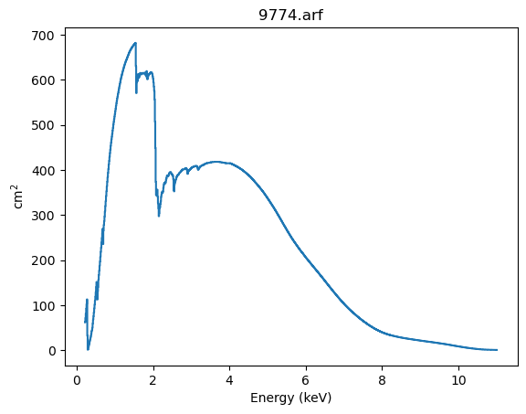
The ARF
First we start with a Chandra ACIS Auxiliary Response File (ARF):
[3]:
arf = io.read_arf(datafile("9774.arf"))
# Hide the full path name to make the plot title look nicer
arf.name = "9774.arf"
The first thing to do is print the structure, which displays the basic components:
the energy grid over which the response is defined (the
energ_loandenerg_hifields, which are in keVthe
specrespfield which gives the response (the effective area, in cm\(^2\), for each energy bin
[4]:
print(arf)
name     = 9774.arf
energ_lo = Float64[1078]
energ_hi = Float64[1078]
specresp = Float64[1078]
exposure = 75141.231099099
ethresh  = 1e-10
For notebook users we can just ask the notebook to display this object, which displays a plot of the data and some of the metadata stored with it:
[5]:
arf
[5]:
ARF Plot
Summary (5)
Metadata (6)
We can also create a Sherpa plot object directly:
[6]:
aplot = ARFPlot()
aplot.prepare(arf)
This structure contains the data needed to create a plot (and can be created even if no Sherpa plotting backend is available):
[7]:
print(aplot)
xlo    = [ 0.22, 0.23, 0.24,...,10.97,10.98,10.99]
xhi    = [ 0.23, 0.24, 0.25,...,10.98,10.99,11.  ]
y      = [61.9221,71.4127,81.3637,..., 0.5701, 0.5516, 0.5332]
xlabel = Energy (keV)
ylabel = cm$^2$
title  = 9774.arf
histo_prefs = {'xlog': False, 'ylog': False, 'label': None, 'xerrorbars': False, 'yerrorbars': False, 'color': None, 'linestyle': 'solid', 'linewidth': None, 'marker': 'None', 'alpha': None, 'markerfacecolor': None, 'markersize': None, 'ecolor': None, 'capsize': None}
When a plotting backend is available we can display the data, which shows a plot essentially the same as the “rich display” above, but without the metadata:
[8]:
aplot.plot()
The RMF
Displaying the Redistribution Matrix File (RMF) is harder, because it is an intrinsically two-dimensional object, as it describes how the physical properties of the X-ray signal (in this case, the energy or wavelength) is mapped onto the detector properties (channel).
[9]:
rmf = io.read_rmf(datafile("9774.rmf"))
rmf.name = "9774.rmf"
The matrix is stored in a compressed form, and hard to understand from the object display:
[10]:
print(rmf)
name     = 9774.rmf
energ_lo = Float64[1078]
energ_hi = Float64[1078]
n_grp    = UInt64[1078]
f_chan   = UInt64[1481]
n_chan   = UInt64[1481]
matrix   = Float64[438482]
e_min    = Float64[1024]
e_max    = Float64[1024]
detchans = 1024
offset   = 1
ethresh  = 1e-10
The “rich display” picks 5 energies, spaced logarithmically across the energy response of the RMF, and shows the behavior of monochromatic emission at this energy, along with some of the metadata related to the file.
We can see why fitting X-ray data can be hard, since 3 keV photons do peak at 3 keV but can also be observed down to 1 keV.
[11]:
rmf
[11]:
RMF Plot
Summary (5)
Metadata (6)
Note that there is no equivalent to the ARFPlot class for RMF.
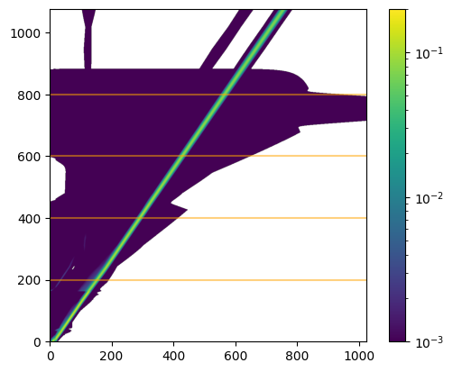
New in Sherpa 4.16.0 is the ability to convert a RMF into a 2D image, which shows the relationship between channel (X axis) and energy (Y axis). It is essentially the same as the CIAO tool rmfimg.
We can convert a RMF into a DataIMG structure:
[12]:
image_rmf = instrument.rmf_to_image(rmf)
As always, let’s see what is stored in it. Although the data in in 2D, the DataIMG structrure flattens it out into 1D arrays:
[13]:
print(image_rmf)
name      = 9774.rmf
x0        = Int64[1103872]
x1        = Int64[1103872]
y         = Float64[1103872]
shape     = (1078, 1024)
staterror = None
syserror  = None
sky       = None
eqpos     = None
coord     = logical
However, we can use the rich display to show this data. Note that this uses a linear scale for the data, and so all we see is the “main” response, which shows the main peaks we saw in the line plot above.
Although not labelled, the X axis is in channel space. For the Chandra ACIS detector this has 1024 channels. The Y axis is energy range, which depends on how the RMF was built (it maps to the ENERG_LO and ENERG_HI columns from the MATRIX block of the RMF, in this case accessible as rmf.energ_lo and rmf.energ_hi).
[14]:
image_rmf
[14]:
DataIMG Plot
Metadata (2)
The matrix can be retrieved directly with rmf_to_matrix rather than rmf_to_image (we could reconstruct the data from the image_rmf structure, but the following is a lot more informative):
[15]:
matinfo = instrument.rmf_to_matrix(rmf)
This object does not have a “nice” string representation, but it contains three fields:
matrixchannelsenergies
The matrix is the 2D data shown above:
[16]:
print(matinfo.matrix.shape)
(1078, 1024)
[17]:
print(f"min      = {matinfo.matrix.min()}")
print(f"min (>0) = {matinfo.matrix[matinfo.matrix>0].min()}")
print(f"max      = {matinfo.matrix.max()}")
min      = 0.0
min (>0) = 8.81322481660618e-09
max      = 0.13163885474205017
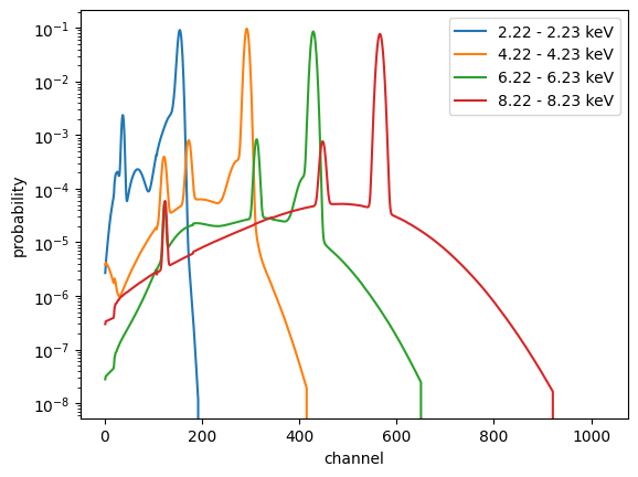
This can be displayed with a log scale, to show off some of the secondary features we saw in the monochromatic energy response above. The horizontal lines are added to indicate rows which we shall investigate later.
[18]:
from matplotlib import colors

plt.imshow(matinfo.matrix, origin='lower', norm=colors.LogNorm(vmin=1e-3, vmax=0.2))
plt.colorbar()

for pos in [200, 400, 600, 800]:
    plt.axhline(pos, alpha=0.5, c='orange')
We can use this data to try and reconstruct the monochromatic response plot from above. We can pick a row from the matrix, which will be the response for a photon at a fixed energy (well, a photon in the finite energy range given by the corresponding element from the energ_lo and energ_hi fields).
Selecting values along the Y axis selects different ranges (and let’s us explore some of the features seen above). One difference to the rich display above is that this plot uses channel number for the X axis rather than converting this to an “approximate” energy (as done above), by using the E_MIN and E_MAX fields from the EBOUNDS block of the RMF (available as rmf.e_min and rmf.e_max).
[19]:
for idx in [200, 400, 600, 800]:
    # We could use matinfo.energies, but as we have the RMF object we use that instead.
    elo = rmf.energ_lo[idx]
    ehi = rmf.energ_hi[idx]
    plt.plot(np.arange(1, 1025), matinfo.matrix[idx, :], label=f"{elo:.2f} - {ehi:.2f} keV")

plt.yscale('log')
plt.xlabel("channel")
plt.ylabel("probability")
plt.legend();
Looking at a different detector
The Sherpa test data directory contains a response file for the ROSAT PSPC-C instrument, which operated in the 1990s, and used a different detector to the CCD detector used in ACIS. We can see how different by viewing the response using the techniques from above:
[20]:
rsp_pspcc = io.read_rmf(datafile("pspcc_gain1_256.rsp"))
rsp_pspcc.name = "pspcc_gain1_256.rsp"
rsp_pspcc
[20]:
RMF Plot
Summary (5)
Metadata (5)
[21]:
instrument.rmf_to_image(rsp_pspcc)
[21]:
DataIMG Plot
Metadata (2)
Note that the ROSAT RMF includes the effective area (i.e. ARF) terms, which is why the matrix values are greater than 1 and some of the vertical structure of the plot. The lower resolving power of the instrument - compared to the ACIS CCD - is shown by the fact the line above is not as sharp as the ACIS version above. If we used a Chandra grating RMF the line would be much narrower (but it was not included here as it is harder to see as there’s a lot more pixels).
Using the responses
How do we apply the response to a model?
[22]:
from sherpa.astro.instrument import ARF1D, RMF1D, RSPModelNoPHA
from sherpa.models.basic import Delta1D, NormGauss1D
There are several ways of applying the response. Here we chose to use the “wrapper” models ARF1D and RMF1D to convert the DataARF and DataRMF structures into “convolution-style” models[\(\dagger\)].
[\(\dagger\)] technically only the RMF needs to be handled as a convolution model, but for historical reasons the ARF is handled the same way.
[23]:
aconv = ARF1D(arf)
rconv = RMF1D(rmf)
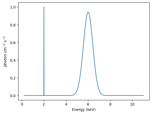
Let’s create a model consisting of a delta function, at 2 keV, together with a gaussian centered at 6 keV and with a FWHM of 1 keV:
[24]:
dmodel = Delta1D("delta")
gmodel = NormGauss1D("gauss")

dmodel.pos = 2
gmodel.pos = 6
gmodel.fwhm = 1

# Adjust the gaussian amplitude so that it is more visible.
gmodel.ampl = 100

model_base = dmodel + gmodel
model_base
[24]:
Model
| Component | Parameter | Thawed | Value | Min | Max | Units |
|---|---|---|---|---|---|---|
| delta | pos | 2.0 | -MAX | MAX | ||
| ampl | 1.0 | -MAX | MAX | |||
| gauss | fwhm | 1.0 | TINY | MAX | ||
| pos | 6.0 | -MAX | MAX | |||
| ampl | 100.0 | -MAX | MAX |
Let’s just check that both components have the integrate flag set to True (the composite model does not pass through the integrate setting of its components in Sherpa 4.16.0):
[25]:
dmodel.integrate, gmodel.integrate
[25]:
(True, True)
We can evaluate this to get “the truth” (for XSPEC additive models the per-bin value would have units of photon / cm\(^2\) / s, but for the Sherpa models we can give the ampl parameter (for these two models) whatever units we want, so let’s also assume the same units as XSPEC.
[26]:
y_base = model_base(rmf.energ_lo, rmf.energ_hi)

emid = (rmf.energ_lo + rmf.energ_hi) / 2
plt.plot(emid, y_base)
plt.xlabel("Energy (keV)")
plt.ylabel("photon cm$^{-2}$ s$^{-1}$");
The ARF is incluced by “convolving” the base model by the ARF model. Note that, as the ARF contains an exposure time, the model automatically includes this, which means that the output is now not a rate. In fact, because the ARF has units of cm\(^2\), the model evaluation will calculate the number of photons per bin.
[27]:
model_arf = aconv(model_base)
model_arf
[27]:
Model
| Component | Parameter | Thawed | Value | Min | Max | Units |
|---|---|---|---|---|---|---|
| delta | pos | 2.0 | -MAX | MAX | ||
| ampl | 1.0 | -MAX | MAX | |||
| gauss | fwhm | 1.0 | TINY | MAX | ||
| pos | 6.0 | -MAX | MAX | |||
| ampl | 100.0 | -MAX | MAX |
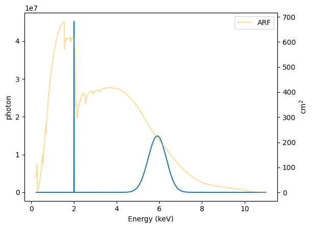
Each bin is multiplied by the ARF, so - since the ARF is not flat - the relative signal will change. The ARF is shown in orange (see the right axis) to also show the effective area at each energy.
[28]:
y_arf = model_arf(rmf.energ_lo, rmf.energ_hi)

plt.plot(emid, y_arf)
plt.xlabel("Energy (keV)")
plt.ylabel("photon")

ax2 = plt.twinx();
emid2 = (arf.energ_lo + arf.energ_hi) / 2
ax2.plot(emid, arf.specresp, alpha=0.4, c="orange", label="ARF")
ax2.set_ylabel("cm$^2$")
plt.legend();
We can repeat this for the RMF, noting that the output - because the ARF is not included - will have the unusual units of count / cm\(^2\) / s:
[29]:
model_rmf = rconv(model_base)
model_rmf
[29]:
Model
| Component | Parameter | Thawed | Value | Min | Max | Units |
|---|---|---|---|---|---|---|
| delta | pos | 2.0 | -MAX | MAX | ||
| ampl | 1.0 | -MAX | MAX | |||
| gauss | fwhm | 1.0 | TINY | MAX | ||
| pos | 6.0 | -MAX | MAX | |||
| ampl | 100.0 | -MAX | MAX |
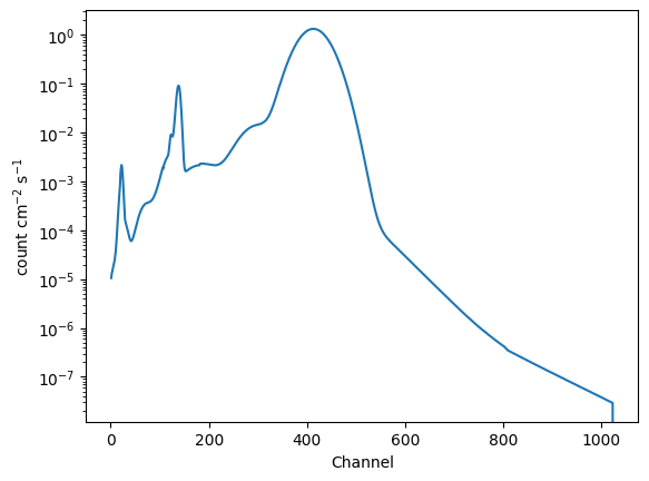
An interesting part of this is that the RMF converts between physical units (energy or wavelength), which is used to evaluate the “wrapped” model (in this case model_base), and returns values in channel space. This means that we no-longer supply the convolved model with energies, but with channels.
The obvious differences to above are that the relative intensity of the delta function and gaussian has drastically changed, and the blurring of the created by the RMF is visible (well, it is once you change to a logarithmic scale for the Y axis).
[30]:
channels = np.arange(1, 1025, dtype=np.int16)
y_rmf = model_rmf(channels)

plt.plot(channels, y_rmf)
plt.xlabel("Channel")
plt.ylabel("count cm$^{-2}$ s$^{-1}$")
plt.yscale("log");
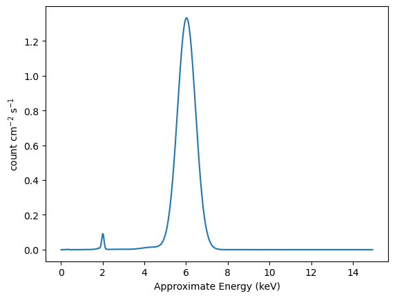
We can use the “approximate” energies from the RMF to get a plot more similar to the plot_data command (UI) or DataPHAPlot (direct use of the plotting classes):
[31]:
emid_approx = (rmf.e_min + rmf.e_max) / 2

plt.plot(emid_approx, y_rmf)
plt.xlabel("Approximate Energy (keV)")
plt.ylabel("count cm$^{-2}$ s$^{-1}$");
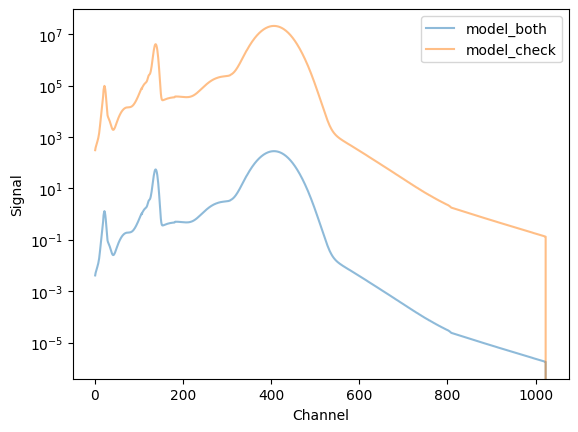
We could combine both with an expression like
rconv(aconv(model_base))
but we shall also use the RSPModelNoPHA class, which takes ARF, RMF, and the model as arguments:
[32]:
model_both = RSPModelNoPHA(arf, rmf, model_base)
model_check = rconv(aconv(model_base))
[33]:
model_both
[33]:
Model
| Component | Parameter | Thawed | Value | Min | Max | Units |
|---|---|---|---|---|---|---|
| delta | pos | 2.0 | -MAX | MAX | ||
| ampl | 1.0 | -MAX | MAX | |||
| gauss | fwhm | 1.0 | TINY | MAX | ||
| pos | 6.0 | -MAX | MAX | |||
| ampl | 100.0 | -MAX | MAX |
[34]:
model_check
[34]:
Model
| Component | Parameter | Thawed | Value | Min | Max | Units |
|---|---|---|---|---|---|---|
| delta | pos | 2.0 | -MAX | MAX | ||
| ampl | 1.0 | -MAX | MAX | |||
| gauss | fwhm | 1.0 | TINY | MAX | ||
| pos | 6.0 | -MAX | MAX | |||
| ampl | 100.0 | -MAX | MAX |
The model display for model_both is interesting, since it does not include the exposure time![\(\dagger\dagger\)]
This means that the y_both output is a rate (count / s), whereas y_check has units of count.
[\(\dagger\dagger\)] Please check the Sherpa issues page as this behaviour may change.
[35]:
y_both = model_both(channels)
y_check = model_check(channels)

plt.plot(channels, y_both, label="model_both", alpha=0.5)
plt.plot(channels, y_check, label="model_check", alpha=0.5)

plt.xlabel("Channel")
plt.ylabel("Signal")
plt.legend()
plt.yscale("log");
So, here we have evaluated a model and passed it through both the ARF and RMF.