A sample of plots
The idea of this notebook is to show off a number of plot types, and act as a simple check of the plotting output. It requires matplotlib and does not attempt to describe the plots (see the help for the plot constructor for this!).
[1]:
import numpy as np

%matplotlib inline
[2]:
from sherpa import data
from sherpa.astro import data as astrodata

from sherpa import plot
from sherpa.astro import plot as astroplot
One dimensional data plots
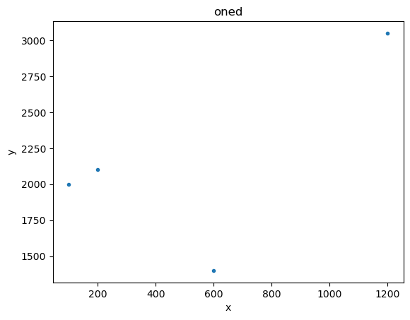
[3]:
x1 = [100, 200, 600, 1200]
y1 = [2000, 2100, 1400, 3050]

d1 = data.Data1D('oned', x1, y1)

plot1 = plot.DataPlot()
plot1.prepare(d1)
plot1.plot()
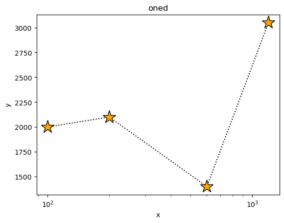
We can have some fun with the plot options (these are a mixture of generic options, such as xlog, and ones specific to the plotting backend - which here is matplotlib - such as marker).
[4]:
plot1.plot(xlog=True, linestyle='dotted', marker='*', markerfacecolor='orange', markersize=20, color='black')
The plot object contains the preferences - here we look at the default plot settings. Note that some plot types have different - and even multiple - preference settings.
[5]:
plot.DataPlot.plot_prefs
[5]:
{'xlog': False,
 'ylog': False,
 'label': None,
 'xerrorbars': False,
 'yerrorbars': True,
 'color': None,
 'linestyle': 'None',
 'linewidth': None,
 'marker': '.',
 'alpha': None,
 'markerfacecolor': None,
 'markersize': None,
 'ecolor': None,
 'capsize': None}
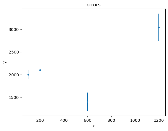
Error bars - here on the dependent axis - can be displayed too:
[6]:
dy1 = [100, 50, 200, 300]
d2 = data.Data1D('errors', x1, y1, dy1)

plot2 = plot.DataPlot()
plot2.prepare(d2)

plot2.plot()
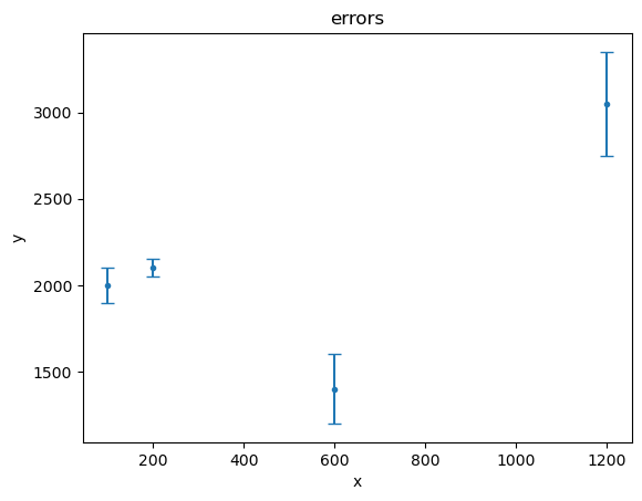
[7]:
plot2.plot(capsize=4)
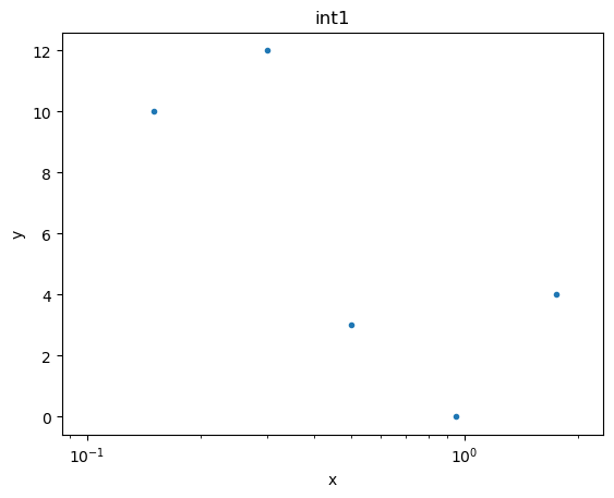
Histogram-style data (with low and high edges) are handled similarly:
[8]:
xlo2 = [0.1, 0.2, 0.4, 0.8, 1.5]
xhi2 = [0.2, 0.4, 0.6, 1.1, 2.0]
y2 = [10, 12, 3, 0, 4]

data3 = data.Data1DInt('int1', xlo2, xhi2, y2)

plot3 = plot.DataHistogramPlot()
plot3.prepare(data3)
plot3.plot(xlog=True)
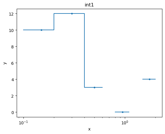
If we want to see the data drawn “like a histogram” then we need to set the linestyle attribute:
[9]:
plot3.plot(xlog=True, linestyle='solid')
The histogram-style plots are an example of a plot using a different name for the preference settings, in this case histo_prefs:
[10]:
plot.DataHistogramPlot.histo_prefs
[10]:
{'xlog': False,
 'ylog': False,
 'label': None,
 'xerrorbars': False,
 'yerrorbars': True,
 'color': None,
 'linestyle': 'None',
 'linewidth': None,
 'marker': '.',
 'alpha': None,
 'markerfacecolor': None,
 'markersize': None,
 'ecolor': None,
 'capsize': None}
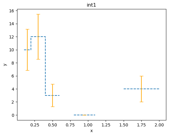
Previously we explicitly set the error values, but we can also use one of the chi-square statistics to come up with error values. In this case it’s just the square-root of the data value (so, for \(x \sim 1\) bin, we have an error of 0):
[11]:
from sherpa.stats import Chi2DataVar

plot4 = plot.DataHistogramPlot()
plot4.prepare(data3, stat=Chi2DataVar())
plot4.plot(linestyle='dashed', marker=None, ecolor='orange', capsize=4)
Axis labelling
The axis labels depend on the plot object and the data used in the prepare call. Functionality added in release 4.17.0 allows us to change the labels with the set_xlabel and set_ylabel calls of the Data class:
[12]:
# These changes must be made before the call to prepare.
data3.set_xlabel("distance [kpc]")
data3.set_ylabel("Relative abundance")

plot5 = plot.DataHistogramPlot()
plot5.prepare(data3)

plot5.plot(linestyle="solid", marker=None)
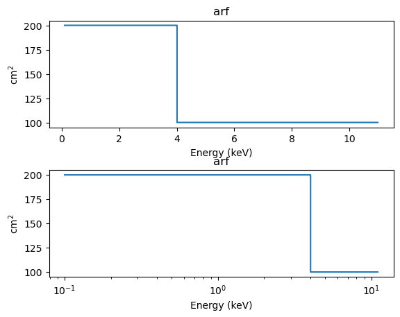
PHA-related plots
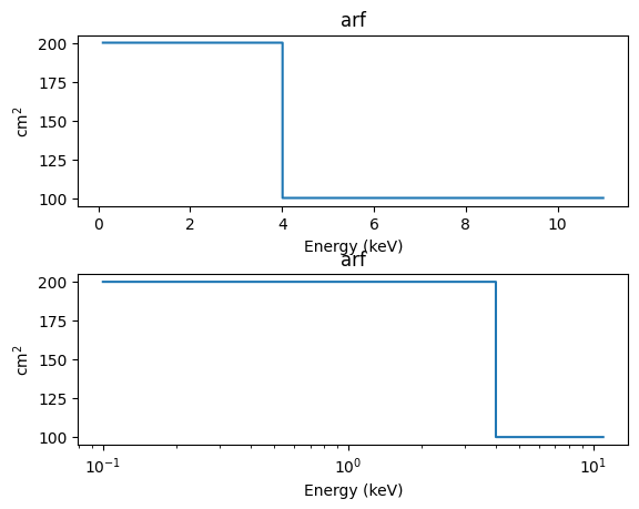
We start with an ARF from a rather simple instrument. This time we also use the SplitPlot class to create multiple plots (although this could be done just as easily with matplotlib functions):
[13]:
energies = np.arange(0.1, 11, 0.01)
elo = energies[:-1]
ehi = energies[1:]

arf = 100 * np.ones_like(elo)
arf[elo < 4] = 200

darf = astrodata.DataARF('arf', elo, ehi, arf)
aplot = astroplot.ARFPlot()
aplot.prepare(darf)

splot = plot.SplitPlot()

splot.addplot(aplot)
splot.addplot(aplot, xlog=True)
The preferences for the split plot are empty by default, because there are no backend-independent settings:
[14]:
splot.plot_prefs
[14]:
{}
However, here we are using matplotlib and we can get “hspace” “wspace” etc as in plt.subplots_adjust to tweak the plot layout:
[15]:
splot.reset()
splot.plot_prefs['hspace'] = 0.6

splot.addplot(aplot)
splot.addplot(aplot, xlog=True)
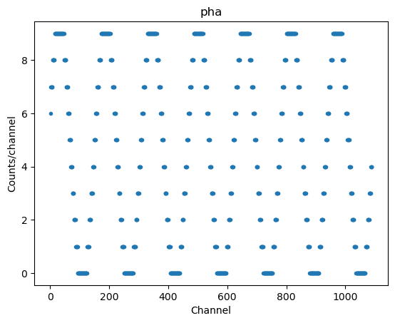
A PHA, which matches the ARF, can be created (with a sinusoidal pattern just to show something different):
[16]:
chans = np.arange(1, len(elo) + 1, dtype=np.int16)
counts = 5 + 5 * np.sin(elo * 4)
counts = counts.astype(int)

dpha = astrodata.DataPHA('pha', chans, counts)

pplot = astroplot.DataPHAPlot()
pplot.prepare(dpha)

pplot.plot()
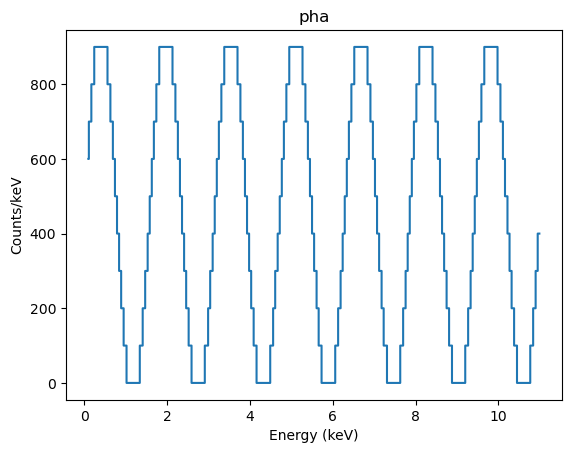
Adding the ARF to the data allows us to change to energy units:
[17]:
dpha.set_arf(darf)
dpha.set_analysis('energy')

pplot.prepare(dpha)
pplot.plot(linestyle='solid', marker=None)
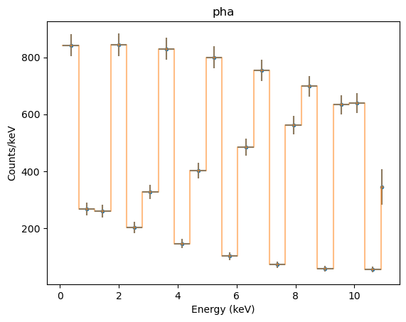
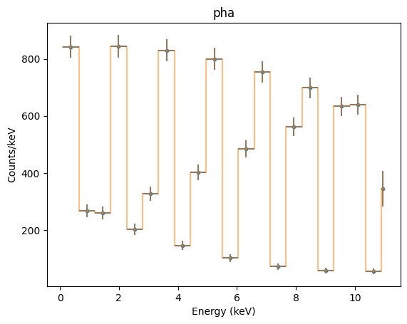
Grouping the data - in this case in 20-channel groups - allows us to check the “x errorbar” handling (the ‘errors’ here just indicate the bin width, and so match the overplotted orange line):
[18]:
dpha.group_bins(20)

pplot.prepare(dpha, stat=Chi2DataVar())
pplot.plot(xerrorbars=True, yerrorbars=True)
pplot.overplot(linestyle='solid', alpha=0.5, marker=None)
We can see how a model looks for this dataset - in this case a simple sinusoidal model which is multiplied by the ARF (shown earlier), and so is not going to match the data.
[19]:
from sherpa.models.basic import Sin
from sherpa.astro.instrument import Response1D

mdl = Sin()
mdl.period = 4

# Note that the response information - in this case the ARF and channel-to-energy mapping - needs
# to be applied to the model, which is done by the Response1D class in this example.
#
rsp = Response1D(dpha)
full_model = rsp(mdl)
print(full_model)
apply_arf(sin)
   Param        Type          Value          Min          Max      Units
   -----        ----          -----          ---          ---      -----
   sin.period   thawed            4        1e-10           10
   sin.offset   thawed            0            0  3.40282e+38
   sin.ampl     thawed            1        1e-05  3.40282e+38
Note that the ModelHistogram class does not use the grouping of the PHA dataset, so it shows the model evaluated per channel:
[20]:
mplot = astroplot.ModelHistogram()
mplot.prepare(dpha, full_model)

mplot.plot()
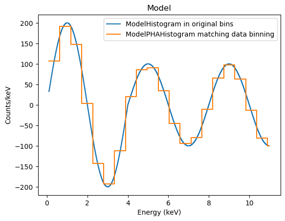
The discontinuity at 4 keV is because of the step function in the ARF (200 cm\(^2\) below this energy and 100 cm\(^2\) above it).
The ModelPHAHistogram class does group the model to match the data:
[21]:
mplot2 = astroplot.ModelPHAHistogram()
mplot2.prepare(dpha, full_model)

mplot.plot(label='ModelHistogram in original bins')
mplot2.overplot(label='ModelPHAHistogram matching data binning')
Object-less plots
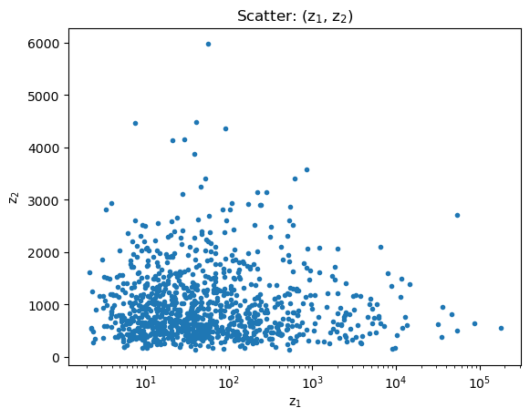
There are a number of plot classes that don’t need a data object, such as scatter plots:
[22]:
rng = np.random.default_rng(1273)

# I've never used the Wald distribution before, so let's see how it looks...
#
z1 = rng.wald(1000, 20, size=1000)
z2 = rng.wald(1000, 2000, size=1000)

# We take advantage of matplotlib functionality in labelling the axes and title.
#
splot = plot.ScatterPlot()
splot.prepare(z1, z2, xlabel='z$_1$', ylabel='z$_2$', name='(z$_1$, z$_2$)')
splot.plot(xlog=True)
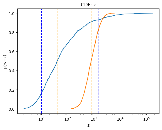
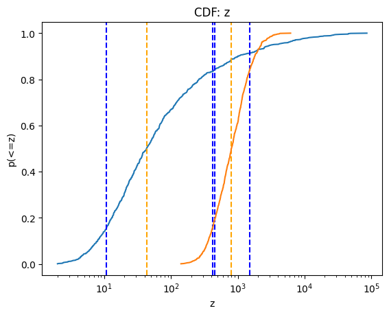
and cumulative plots:
[23]:
cplot = plot.CDFPlot()

cplot.prepare(z1, xlabel='z', name='z')
cplot.plot(xlog=True)

cplot.prepare(z2)
cplot.overplot()
Note that this is a small sampling of the available plot types (although most are variants of plotting either the data or a model).