Visualisation
Overview
Sherpa has support for different plot backends, although at present there is only one, which uses the matplotlib package. Interactive visualizations of images is provided by DS9 - an Astronomical image viewer - if installed, whilst there is limited support for visualizing two-dimensional data sets with matplotlib. The classes described in this document do not need to be used, since the data can be plotted directly, but they do provide some conveniences.
The basic approach to creating a visualization using these classes is:
create an instance of the relevant class (e.g.
DataPlot);send it the necessary data with the
prepare()method (optional);perform any necessary calculation with the
calc()method (optional);and plot the data with the
plot()orcontour()methods (or theoverplot(), andovercontour()variants).
Note
The sherpa.plot module also includes error-estimation
routines, such as the IntervalProjection class. This is mixing
analysis with visualization, which may not be ideal.
Image Display
There are also routines for image display, using the DS9 image viewer for interactive display. How are these used from the object API?
Example
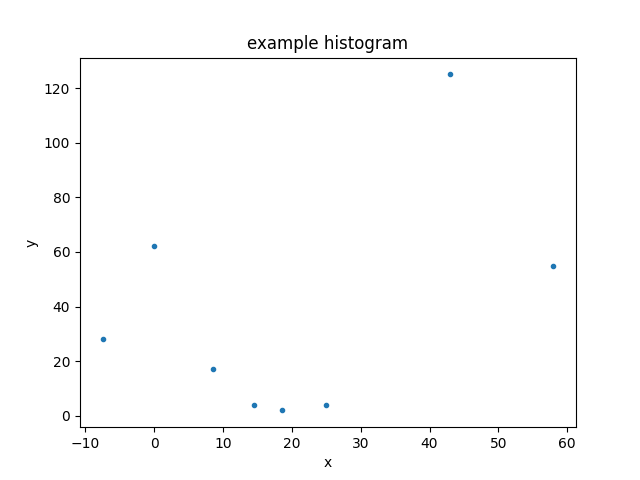
Here is the data we wish to display: a set of consecutive bins, defining the edges of the bins, and the counts in each bin:
>>> import numpy as np
>>> edges = np.asarray([-10, -5, 5, 12, 17, 20, 30, 56, 60])
>>> y = np.asarray([28, 62, 17, 4, 2, 4, 125, 55])
As this is a one-dimensional integrated data set (i.e. a histogram),
we shall use the Data1DInt class to
represent it:
>>> from sherpa.data import Data1DInt
>>> d = Data1DInt('example histogram', edges[:-1], edges[1:], y)
Displaying the data
The DataPlot class can then be used to
display the data, using the prepare()
method to set up the data to plot - in this case the
Data1DInt object - and then the
plot() method to actually plot the
data:
>>> from sherpa.plot import DataPlot
>>> dplot = DataPlot()
>>> dplot.prepare(d)
>>> dplot.plot()
The appearance of the plot will depend on the chosen backend (although as of the Sherpa 4.12.0 release there is only one, using the matplotlib package).
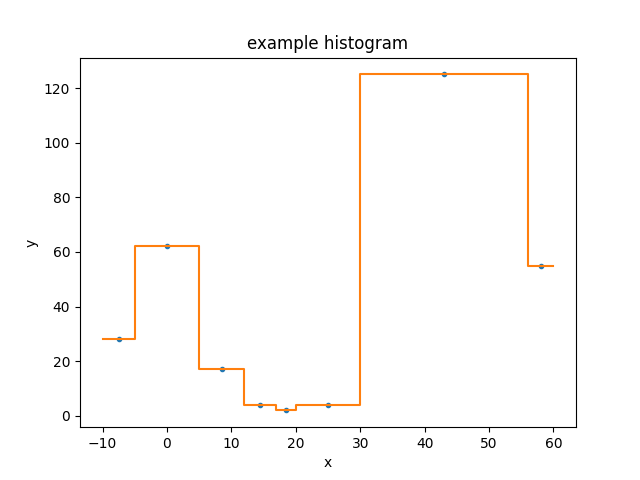
Plotting data directly
Most of the Sherpa plot objects expect Sherpa objects to be sent
to their prepare methods - normally data and model objects,
but plot objects themselves can be passed around for “composite”
plots - but there are several classes that accept the values to
display directly:
Plot,
Histogram,
Point,
and
Contour. Here we use the Histogram
class directly to display the data directly, on top of the
existing plot:
>>> from sherpa.plot import Histogram
>>> hplot = Histogram()
>>> hplot.overplot(d.xlo, d.xhi, d.y)
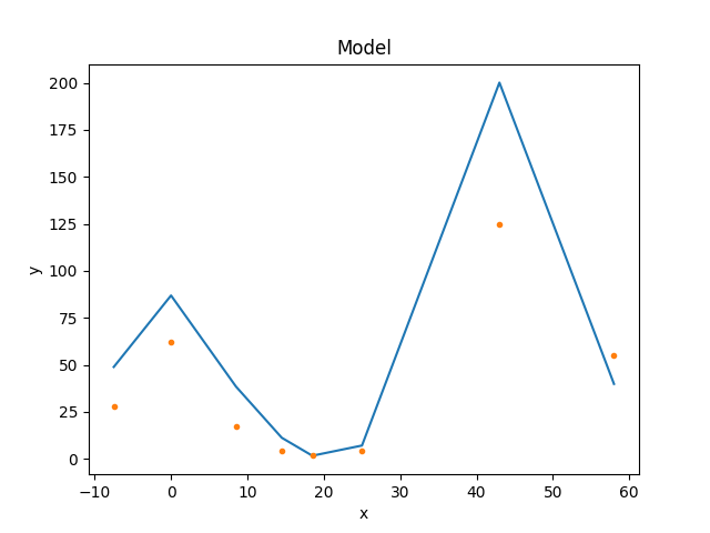
Creating a model
For the following we need a
model to display, so how about
a constant minus a gaussian, using the
Const1D
and
Gauss1D
classes:
>>> from sherpa.models.basic import Const1D, Gauss1D
>>> mdl = Const1D('base') - Gauss1D('line')
>>> mdl.pars[0].val = 10
>>> mdl.pars[1].val = 25
>>> mdl.pars[2].val = 22
>>> mdl.pars[3].val = 10
>>> print(mdl)
(base - line)
   Param        Type          Value          Min          Max      Units
   -----        ----          -----          ---          ---      -----
   base.c0      thawed           10 -3.40282e+38  3.40282e+38
   line.fwhm    thawed           25  1.17549e-38  3.40282e+38
   line.pos     thawed           22 -3.40282e+38  3.40282e+38
   line.ampl    thawed           10 -3.40282e+38  3.40282e+38
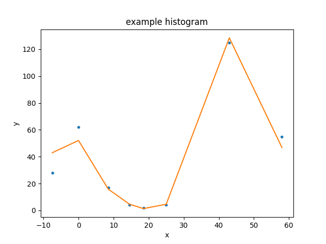
Displaying the model
With a Sherpa model, we can now use the
ModelPlot to display it. Note that unlike
the data plot, the
prepare() method requires
the data and the model:
>>> from sherpa.plot import ModelPlot
>>> mplot = ModelPlot()
>>> mplot.prepare(d, mdl)
>>> mplot.plot()
>>> dplot.overplot()
The data was drawn on top of the model using the
overplot() method
(plot()
could also have been used as long as the
overplot argument was set to True).
Combining the data and model plots
The above plot is very similar to that created by the
FitPlot class:
>>> from sherpa.plot import FitPlot
>>> fplot = FitPlot()
>>> fplot.prepare(dplot, mplot)
>>> fplot.plot()
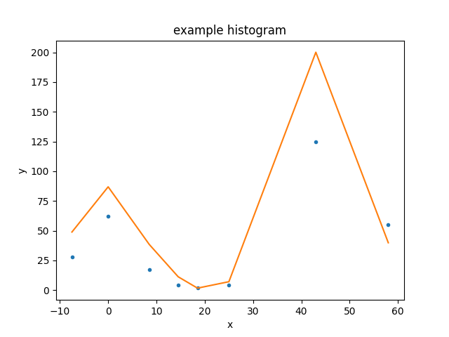
The major difference is that here the data is drawn first, and then the model - unlike the previous example - so the colors used for the line and points have swapped. The plot title is also different.
Changing the plot appearance
There is limited support for changing the appearance of plots, and this can be done either by
changing the preference settings of the plot object (which will change any plot created by the object)
overriding the setting when plotting the data (this capability is new to Sherpa 4.12.0).
There are several settings which are provided for all backends,
such as whether to draw an axis with a logarithmic scale - the
xlog and ylog settings - as well as others that are specific
to a backend - such as the marker preference provided by the
Matplotlib backend. The name of the preference setting depends on
the plot object, for the DataPlot it is
plot_prefs:
>>> print(dplot.plot_prefs)
{'xerrorbars': False, 'yerrorbars': True, 'ecolor': None, 'capsize': None, 'barsabove': False, 'xlog': False, 'ylog': False, 'linestyle': 'None', 'linecolor': None, 'color': None, 'marker': '.', 'markerfacecolor': None, 'markersize': None, 'xaxis': False, 'ratioline': False}
Here we set the y scale of the data plot to be drawn with a log
scale - by changing the preference setting - and then override
the marker and linestyle elements when creating the plot:
>>> dplot.plot_prefs['ylog'] = True
>>> dplot.plot(marker='s', linestyle='dashed')
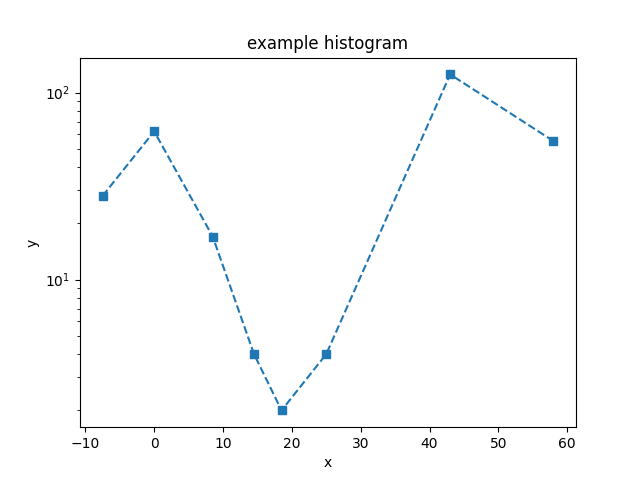
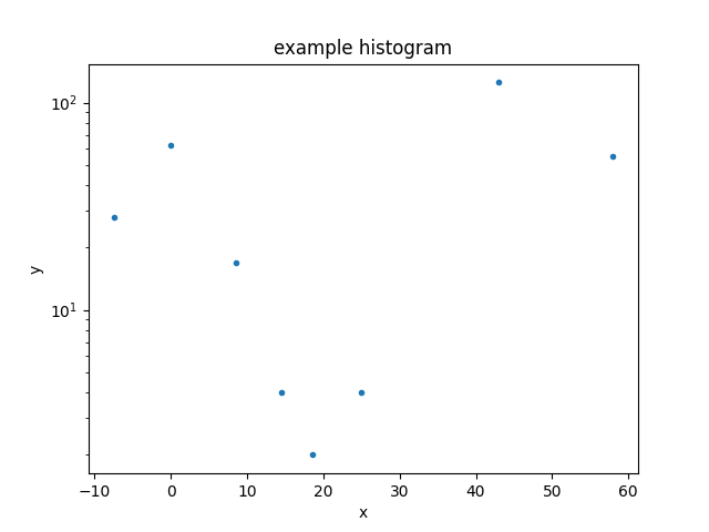
If called without any arguments, the marker and line-style changes are no-longer applied, but the y-axis is still drawn with a log scale:
>>> dplot.plot()
Let’s remove the y scaling so that the remaining plots use a linear scale:
>>> dplot.plot_prefs['ylog'] = False
Updating a plot
Note that for the FitPlot class the
prepare() method
accepts plot objects rather than data and model objects.
>>> from sherpa.optmethods import NelderMead
>>> from sherpa.stats import Cash
>>> from sherpa.fit import Fit
>>> f = Fit(d, mdl, stat=Cash(), method=NelderMead())
>>> f.fit()
The model plot needs to be updated to reflect the new parameter values before we can replot the fit:
>>> mplot.prepare(d, mdl)
>>> fplot.plot()
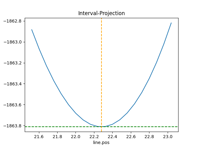
Looking at confidence ranges
The variation in best-fit statistic to a parameter can be
investigated with the IntervalProjection
class (there is also a IntervalUncertainty
but it is not as robust). Here we use the default options for
determining the parameter range over which to vary the gaussian
line position (which corresponds to mdl.pars[2]):
>>> from sherpa.plot import IntervalProjection
>>> iproj = IntervalProjection()
>>> iproj.calc(f, mdl.pars[2])
WARNING: hard minimum hit for parameter base.c0
WARNING: hard maximum hit for parameter base.c0
WARNING: hard minimum hit for parameter line.fwhm
WARNING: hard maximum hit for parameter line.fwhm
WARNING: hard minimum hit for parameter line.ampl
WARNING: hard maximum hit for parameter line.ampl
>>> iproj.plot()
Reference/API
- The sherpa.plot module
- The sherpa.astro.plot module
- DataPHAPlot
- ModelPHAHistogram
- ModelHistogram
- SourcePlot
- ComponentModelPlot
- ComponentSourcePlot
- ARFPlot
- BkgDataPlot
- BkgModelPHAHistogram
- BkgModelHistogram
- BkgFitPlot
- BkgDelchiPlot
- BkgResidPlot
- BkgRatioPlot
- BkgChisqrPlot
- BkgSourcePlot
- OrderPlot
- FluxHistogram
- EnergyFluxHistogram
- PhotonFluxHistogram
- Class Inheritance Diagram
- The sherpa.image module
- The sherpa.plot.utils module